To work well, you have to be comfortable with your tools. We've selected our best Salesforce usability tips for you so you can work well as well!
/! \ Tips that don't require a Salesforce admin will be marked with this icon: 🌟
🌟 The pin
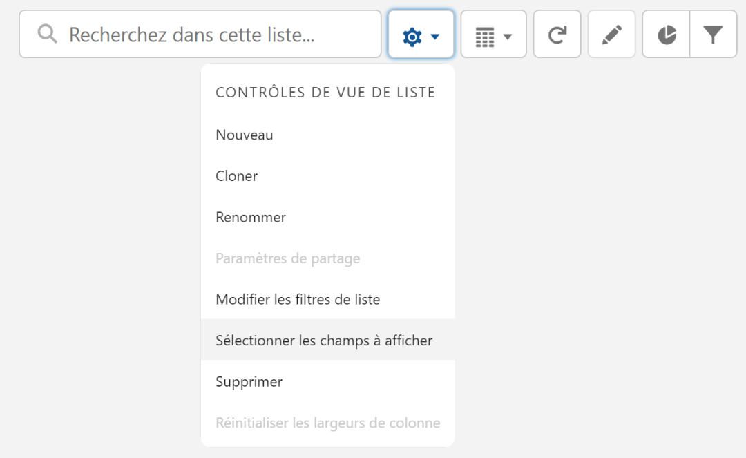
List views are synchronized to the “Recently Viewed” view by default. Our first tip is the little pin you can see next to the name of your list view.

This allows you to choose which list view you want to pin, which is the list view you'll see first when you click on your object. To change your pinned list view, you simply need to click on the name, select the selected view and then click on that pin. If it is straight and colored then your list view is fixed!

The pictograms
Pictograms have entered the corporate world and you can't do without them anymore. Fun, we love to see them everywhere and find THE perfect pictogram. But did you know that it was possible to add them to Salesforce picklists? All you have to do is add the pictograms, chosen as text, when setting up a picklist in order to make them appear for your users!
Be careful, when creating new fields, don't forget to pay close attention to the configured API names. No emphasis in the API name, we try to keep it short and above all concise in order to better navigate in the future.

🌟 The tabs
You can add or remove tabs according to your needs by clicking on the pencil at the top right.

You can organize your tabs however you want. All you have to do is drag and drop them where you want them.
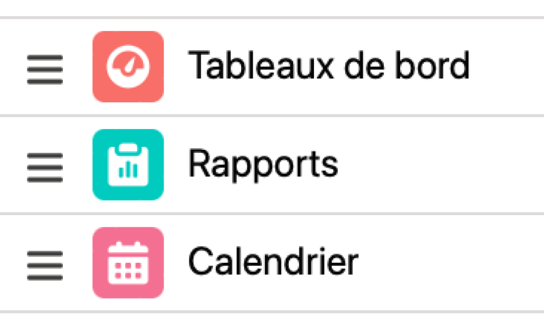
Another method is to drag & drop tabs from your Salesforce page in order to place them as you see fit. All you have to do is keep your mouse pressed on the tab you want to move.

Imaged Kanban
Are you a very visual person, do you like images, icons, in order to understand what you are reading more quickly? This second tip is made for you!
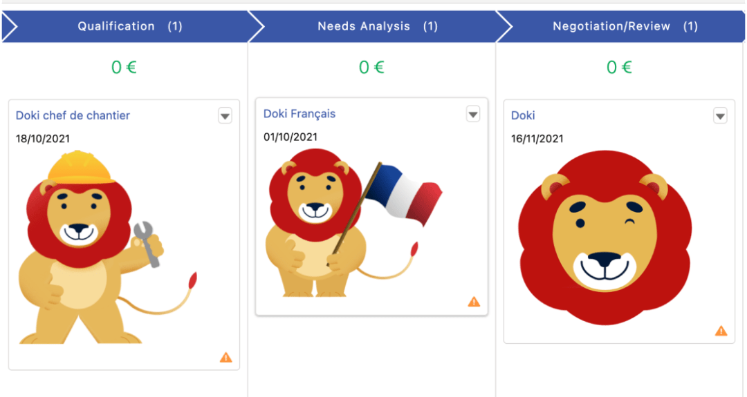
When you create a Kanban view, it is possible to have images appear in it (to better visualize your customers with their logos for example).
For this tip, you will need to add a “rich text” field in order to drop your images into it. Then, when you create your Kanban view, you need to add the newly created field into the fields to be displayed.
Then enjoy your new view with your images!
🌟 Display density
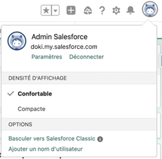
By clicking on Astro (or your photo), at the top right, you can choose the density of information you want to display, either Comfortable or Compact.
The difference between the two? For example, field information is displayed below the field label in the Comfortable version and next to it in the Compact version.
The best way to understand is still to test!
The page layout
Have you ever wondered why the blocks of information on your records were sometimes split into 2/3 — 1/3, or half? This is linked to the layout of your pages and good news: you can change them!
When you are on a page, you can click on the cog wheel at the top right and select “Edit Page.” You must then click on “Change” in order to choose your favorite page layout among the various models. There are several types of models, each with their advantages and disadvantages. To take the example below: the second screen allows us to see more information in part 3 or to access features that may be hidden.

🌟 The favorites
You can bookmark pages directly in Salesforce.
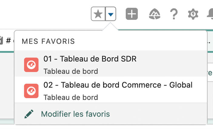
When you are on a page that you use very regularly (a list view, a record, a report, etc.) you can click on the star at the top right of your screen to save it as favorites, it then becomes colored.
Click on the arrow to see all your favorites so you can navigate more quickly!
To remove one of your favorites, simply click on the star again, it then turns gray again.
